Friday 30 March 2012

YB - MEeting

We had a really successful meeting today, the agenda for it was:
Work out the pages in relation to info and images
Work out who's doing what
Work out images realting to disciplines
Work out initial deadline

So we started out by working out the main points of each discipline, in relation to the images that we have taken and how they can fit within the concept of the book:

1. Material culture - Physical process, contextualistation
2. Drawing and Colour - Drawing, process and Tactility
3. Historical and Conservation - Heritage of design, inspiration
4. Ecology and Sustainability - Sustainable design, inspiration
5. Slow crafting - Craftsmanship, production
6. Culture - space and abstract
7. Progressive technologies - Laser cutting, process, production


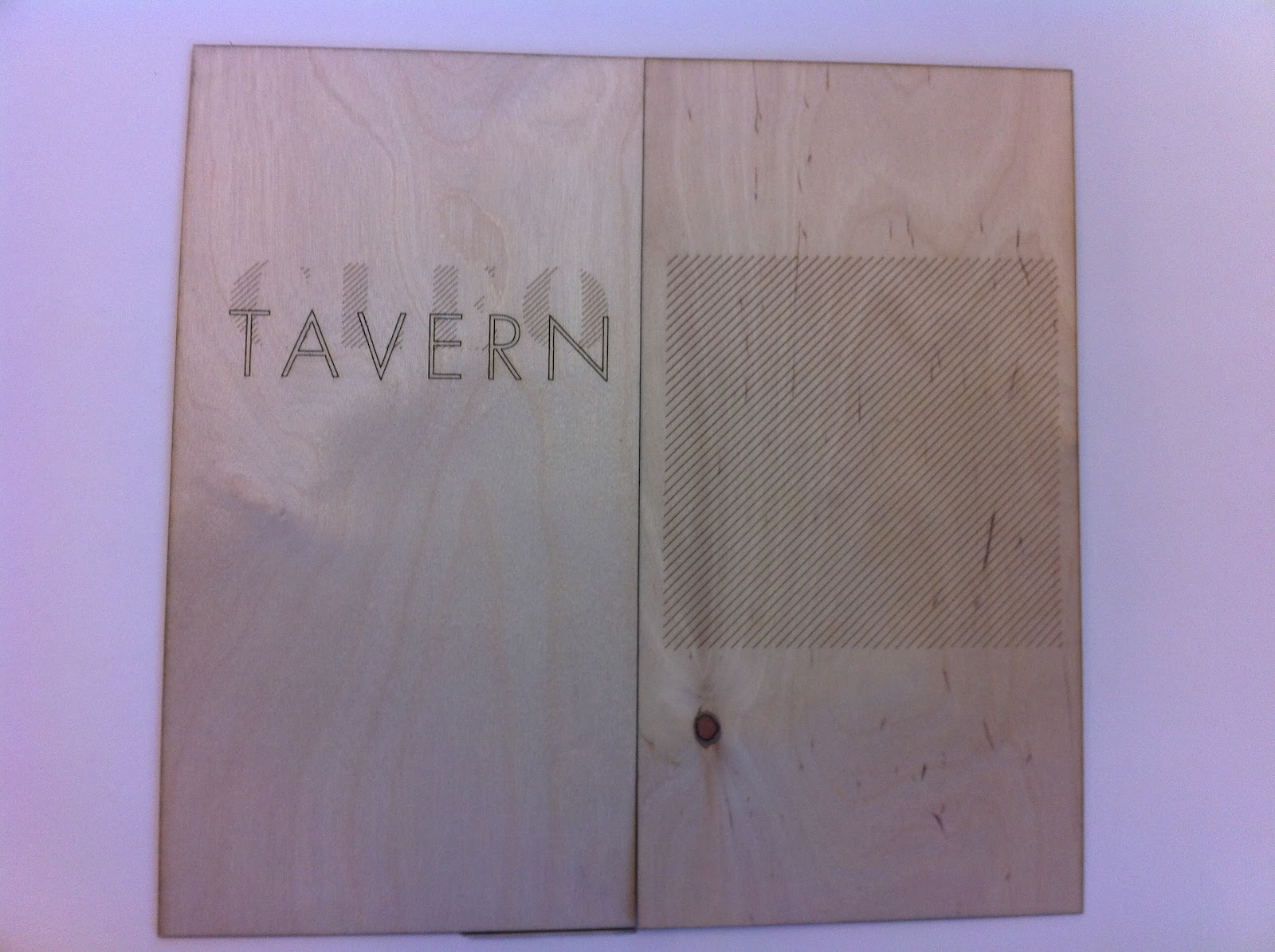
Now that we have these titles and overviews, its a lot easier to place the images in relation to the book,
We decided that we wanted all the disciplines outlined at the beginning of the book so that the rest followed the narrative, and it helped outline the way the book would be read and viewed.


We then went through the book and allocated page spread to each section, initially we thought a double page spread per discipline but soon worked out that would take up too much room, so we instead will do 2 disciplines per double page.


We worked out that excluding the information pages, each section (initial ideas, development and final) would have 22 double page spreads each. Which works out well to showcase their work. 

After working out this, i wanted to try and allocate the style of photographs within the disciplines so we went through all the photographs, from the ones we took and the ones that they had supplied us with. 


We also allocated who was working on what:
Sam and Paul - Images, working out the layout and style of photographs for the sections
Sai and Robyn - Brand imagery (Sai front cover) Typography, and layout of type (Robyn)
Will - Help with images and book cover designs.


ISTD

I have spent some time trying to work out the best format for my publication to go alongside my posters. I know that i want it to be a concertina fold, i just need to work out how it will work and whats the best way to produce it. So i have mapped out the style i want, the content (which i already have) and then did some mock ups to try and see how it would work.

[photos of sketches]
[photos of fold]
[possible finishes]

Fashion Student help

I spoke to a fashion student yesterday about the possibility of her helping sew my envelopes shut with the label. She told me to bring  in the envelops i want and the material on Friday so we could work out the best way to do it.
I went to see her today and showed her my idea:
[skltch]
and she told me that it would have to be done on a domestic sewing machine which she has and that she would do some samples and then send them through to me tonight, so that when im back in Uni we can pick one and she could do it for me.
This has worked out amazingly, and i offered to help her with anything she needed doing in the future to say thanks.

[photo]

YB - Dropbox

Duncan, as promised, emailed the third years with regards to the drop box and what he wanted them to do, which was good. I have also signed up to the account so hopefully we will start getting images through.


YB - Meeting with Duncan

I went over today to speak with Duncan about possible images that he may already have that we could use within the book. He gave me a lot of files that contained second and third year work, and i outlined that this was for 3rd year but he said that they wanted to use this work as well. So we now have an array of different images that we can use. Whether we use them all and mix in the images that we have taken im not sure, but once we have a meeting we can work it out.

My priority is to take the images and work out the different disciplines and the best shots to work with them.
We also discussed the idea of him sending out a drop box invite to all 3rd year so that they can put work in that they want in the year book. He said he would organise it and send me a link, so we shall see if that works.

Thursday 29 March 2012

Cleo Tavern - Tea matts

I have been designing the tea matts that will accompany the saucers for the Cleo Tavern brand. They will are a small brand aesthetic that are showcasing the versatility of the brand image. It's important to try and show the brand working across a range of different and unusual elements so this is why i've chosen to do these matts.


My favorite designs from the development are the white on the two brown colours. This is because they balance well and the type can be seen quite clearly.

Cleo Tavern- Drink menu

I have worked out that double sided printing does not work! not on a laser cutter of digital print! The menu was supposed to be double sided, and i spent ages trying to work out how it would work but i couldn't get it to line up, and it wouldn't register the position of the images. So instead i have done two and i am going to glue them together to that it will be double sided and slightly thicker. I think this could actually work out a lot better.


Cleo Tavern - Menu

I then went on an cut the menu, this was a simple design as it had two separate elements. The front and the back, this didn't take long either which was good.
The next stage with is to work out how to use the outside to work as a menu, like the attachments and the format of it.


______


I really like the idea of the menu having a rivet, so that instead of opening as a normal book you can spin the pages. it adds another dimension to the pages and gives them a more tactile feeling and a different form of interaction with the format of the menu. 


Cleo Tavern

I spent the rest of my laser cut session cutting out the lasered deliverables for this brief. After trying before, i realised that i needed to try and cut everything out and alter the logo slightly so that it would be read as a vector. This was simple enough, i just has to re-outline it so that it wouldn't be seen with all the layers.

I started with the beer matts:
They worked really well, im really happy with them on the fly because its tangible enough to work as a beer matt and too heavy so it wouldn't function.


Im really happy with the aesthetic of the burnt wood, it gives a really lovely definition to the pieces and adds a bit of character to them so that no two matts actually look the same. 


ISTD - rest laser cut

I spent the laser cut session i had to get the rest of the ISTD posters cut, as well as getting a start on the Cleo Tavern devlierables.
The last posters that needed cutting were the longest as they had a lot of type, and complicated patterns so i needed to spend as much time on them as i could.


YB - Information

I received an email from Duncan today, detailing all the information that i have asked for which was good. So finally we have something to work with.


Now that we have this info, we all need to get together work out the pages and break down, as well as delegating the jobs so that we can actually get on designing the book. I am also going to pop over to see Duncan to try and get some more imagery to use within the book.

Lulu - Tissue Paper

I tried screen printing the pattern onto tissue paper today. It didn't work. The ink bled, the pattern got lost and it wasn't a consistant level of paint across the paper, so it ended up looking blotchy. So, im going to have to go back to the drawing board with this idea, and maybe think about digital printing and a different substrate.


// ONLY BIT THAT WAS CLEAR.


So i went to see James, and he said that i cant print on tissue paper downstairs, but i could print on fireproof paper, which is thin and has a rough texture to it. which when looking at it works quite well. Although it is thicker it does add a new texture to the mix which is what im looking for with this brief. So im going to try and print on that and see how it goes.

CLEO TAVERN - GLASS

After investigating, i ordered a glass that would go with my project. I wanted my logo engraved onto it, to see firstly if the logo would work at the size, how it could be worked with if it didnt and whether the concept worked.
Im really happy because it has actually worked. The glass and engraving is clear, and the logo position works well so that when it is full you can still see it. Although it cost a fortune i think it was money well spent, and adds to the interaction with the consumer which is what i wanted.
It also shows that the logo is versatile enough to work on that substrate and at that size. Now i know it works i can propose the idea for mass production.


Wednesday 28 March 2012

DYT - UMW

The next stage i really wanted to try and test out printing it to see if the concept would work, or whether the narrow serifs would get completely lost and therefore not give the definition i want on the page.


Thankfully it worked really well, i couldn't have expected a better print. I didn't want it to be too deep that it'd take away from the type, but deep enough to give definition which has worked really well. The only problem with it is the fact that its a box and may therefore print around that too, living a box emboss but i need to get it cut down to see if this will be a problem.

DYT - UMW

I spent time laser cutting out the smaller bodycopy for the first of the two under milk wood posters, i wanted to experiment with this type face to see if that its stoke would actually work and wouldn't get lost when i embossed it.

I had to outline the text so that it would print correctly, i also
thickened the stroke this was because the laser cutter itself cannot
cut smaller than 2pt, and at the time it was 1.5pt so i needed to ticken it up. 


Yearbook - Images

We went and took more photographs of their studio today, we got quite a lot of similar shots due to the fact that there arnt many 3rd years in at the moment. We are still waiting on the information as well.
So anyway, we went and took more pictures this time focusing on more close ups, more angles that we liked from the last images.
Here are a few more stylrs that we liked:


ISTD

I spent 4 hours in laser cut yesterday afternoon, getting as many of my ISTD boards printed and done before i got kicked out. I managed to get 9 out of the 12 printed, so im quite happy with this progress. The next stage will be to get them varnished and sanded so that they look more professional.
It was a bit of a hassel initially to get the work going, because the settings were wrong for kiss cutting onto 1.5 bendy ply, which meant that when i sent the first one through you couldn't see the kiss cut at all and all you could see what the engrave, which was annoying. So i then had to spend some time adjusting the settings to try and get a more defined cut.

// INITIAL ENGRAVING


// 1st setting, still too light and the engrave was taking away
from the overall image
// 2nd setting, slightly deeper engraving, slowed down the time it took to cut. 
Still not there though, too light, no balance between engrave and kiss cut
// 3rd Adjusted the power, perfect balance between engrave and kiss cut, so this
is the setting that i used for the remainder of my posters.


POSTERS CUT:
1. TOP 10 EARTHQUAKES
2. TOP 10 NATURAL DISASTERS
3. LIGHTENING STRIKE
4. BLIZZARDS
5. FLOOD
6. FAMINE
7. VOLCANO
8. CYCLONE
9. AVALANCHE

STILL TO CUT:
10. ENCOMPASSING ALL - need to change font size, tweak layout

11. TORNADO

12. NORTH KOREA