I have come up with an idea for a new brief that revolves around my idea of branding.
Showing posts with label OUGD303 FMP Briefs. Show all posts
Showing posts with label OUGD303 FMP Briefs. Show all posts
Thursday, 26 April 2012
Monday, 19 March 2012
Thursday, 1 March 2012
Cleo Tavern - Logo development
I think the cross hatch idea was good i theory but once applied, it began to start looking like some fashion logo instead of a restaurant and i dont think the concept behind it is as strong as the straight lines. having said that i could use the cross hatch pattern as part of the identity.
When applying it to a black background it does work, so i also know that when applying colour etc behind it, the logo will still stay defined. This is something that is important otherwise it may get lost when applied to ar ange of different materials.
Wednesday, 29 February 2012
Cleo Tavern logo development 4
This is by far the strongest concept i have come up with, and it transfered to screen well. The idea behind this was taking inspiration from fields/ploughing/rope/string/pony tails. Its a random mix, but simplified down in an abstract format it can create a line pattern that encompasses all these elements. By transferring this onto Bodoni i could get the definition of the lined pattern, whilst using the tavern element to layer over the top and create definition and balance between the two elements. By using this line pattern i can begin to take elements out to create an identity for the brand. I feel a lot more comfortable with this logo and i can see the potential in it, whereas the others i couldn't really see how far they could go and how i could use them to create a cohesive identity.
Cleo tavern logo development 3
The concept behind this logo was adding a slight drag to the letters, this is to insinuate the idea of traveling, speed and movement. Which is all associated with the sort of cliental the stereotypical tavern used to have. I changed to using Bodoni, because it can give more depth and definition to the edit i applied. By balancing it out with avant garde and futura there was a balance between the two types. However, i think that the Cleo element completely overshadows the tavern bit, and the tavern element can end up getting lost. I also applied the over layering technique to the logo, but this again just ended up over complicating everything. I like the concept but i dont think that its strong enough to pull a whole logo together.
Cleo tavern logo development 2
This was another idea, switching the e around. I like the look of it but it is not appropriate for the tavern image, it looks too clinical and it kind of looks like it should be used in a doctors, or at some medical testing facility as opposed to a sophisticated tavern in London. Its gone too far one way. I think the concept it fine, but it isn't appropriate to what i am trying to create.
Cleo Tavern logo development 1
I have started developing the sketch ideas this was the first initial idea i had after re-designing them. I wanted to create something contemporary with a vintage twist, the style of overlaying type is popular at the moment and it gives a nice affect as it creates depth to the logo. I took the concept and started playing around with the placement. The more i worked with it the more i liked the concept of the overlaying, but not necessarily the type face. I think it works for the cleo element of the logo but when i started to add the tavern element then it began too look too complicated and not weighted right.
This style is still a possibility but the general logo is unbalanced and therefore i wont be using it.
Tuesday, 28 February 2012
Under Milk wood
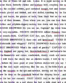
I have tried again with the Under Milk wood text, theres a lot less body copy so it's given me more room with the size of the type and the way that it works. I think that it actually works better. If i can establish a trend in this poster then i can apply the same format to the structure of the next poster regardless of the amount of body copy.
These are some absic attempts at overlaying the quotes. They need a lot of work, and im not sure the bestw ay to achieve it so im going to ahve to do a lot of experimenting to get it wrong.
LOTR - initial test
LOTR
I have tried out some initial ideas for the background of the poster to be the test from the books. Taking one of the larger books that i have available - Lord of the rings (LOTR) - I have attempted to fit in the whole text on one poster. When i did that i had to drop the text down to 2pt..which is ridiculous. So i have deiced thats the wrong avenue and i may have to spread it across more than one poster, which in turn does give me more room to put quotes from the text on.
I have tried out some initial ideas for the background of the poster to be the test from the books. Taking one of the larger books that i have available - Lord of the rings (LOTR) - I have attempted to fit in the whole text on one poster. When i did that i had to drop the text down to 2pt..which is ridiculous. So i have deiced thats the wrong avenue and i may have to spread it across more than one poster, which in turn does give me more room to put quotes from the text on.
// All of this is a little too small, i need to check how many posters i need to get this text across in order for it to work.
Stories
For the Dylan Thomas brief i need all the body copy of the books so that i can try and use it in the posters. So it restricts the amount of authors and stories i can use if i cannot get the body copy for the posters themselves.
I have got a range of links at the moment that have the body copy i want, in the format i need to use them:
WUTHERING HEIGHTS
A TALE OF TWO CITIES
UNDERMILK WOOD
GREAT EXPECTATIONS
LORD OF THE RINGS
THE COLLECTED SHORT STORIES OF ROALD DAHL
I have got a range of links at the moment that have the body copy i want, in the format i need to use them:
WUTHERING HEIGHTS
A TALE OF TWO CITIES
UNDERMILK WOOD
GREAT EXPECTATIONS
LORD OF THE RINGS
THE COLLECTED SHORT STORIES OF ROALD DAHL
Re-Evaluated Dylan Brief
Labels:
Brief 2 - Cleo Tavern -Key Evaluations,
Brief 4 - Dylan Thomas - DC,
Brief 4 - Dylan Thomas - DP,
Brief 4 - Dylan Thomas - Key Evaluations,
Brief 5 - ISTD - Key Evaluations,
Brief 7 - Branding - Key Evaluations,
OUGD303 FMP Briefs,
OUGD303 FMP Project File,
OUGD303DP
Lulu
I have been developing a pattern idea to use across the range of deliverables that i want to use for the Lulu brief. I want something that is simple in its form but can be used to create either a complex or subtle pattern. I dont want this brief to just be some 2 dimensional stationary and delivery brief, its important to have something that is tangible and when received.
Monday, 27 February 2012
Yearbook - development
// I have developed the ideas and sketches, into something thats more consistent. I think that it's important to try and create some initial structure. I have taken on the initial designs for the circles, and coding system so that it can work throughout the book, whilst at the same time illustrating what part of the book is being shown.
Yearbook
I have just been playing around with different formats of the buttons, and colours just to try and work out how they could work together.
Out of all the trials i like the last one. The singular lines works well to create a pattern, within a pattern. Throughout the book this could work really well, and it helps illustrate the part of narrative the book is explaining.
Yearbook - development
I have chosen the two designs that i like and from there i have mocked them up, looking at new grid formats and the positioning of images.
Because they are looking for a more look-book style of design then i think its important to give a lot of space for images and freedom to layout the most important images.
However i have formed a structure for the text, as well as a the vectors that help illustrate the
narrative.
// LAYOUT 1
// LAYOUT 2
I think that from both i like the layout of the text from the 2nd and the vectors of the first. When speaking to the Printed textiles team i remember them saying that they liked the layout of the text that was on our proposal boards. So that is why i think it is important to incorporate this into the text.
I am going to bring both together and develop them as one instead or separately.
Yearbook - initial sketch layouts
For Monday we all agreed to have some design ideas for the layout. They didn't have to be anything ground breaking, but enough so that when we got together we could pull everyones ideas together and then finalise the layout for the book.
The idea behind my layouts is the coding system to clearly layout the narrative of the book so that it works and is identifiable to the person reading it.
They wanted an abstract style of book, so i have kept that in mind. Whilst using a simple system and simple vector ideas to portray the narrative.
I have done some initial sketches.
I think my 2 favorite are the first and the last. Using the block system to transfer through the book so that it will illustrate the narrative. Using a colour coding system to illustrate the transition between each chapter and each style.
Friday, 24 February 2012
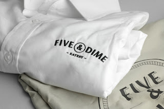
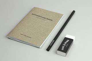
Five and Dime
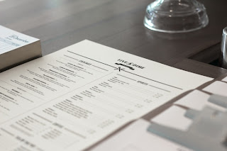
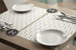
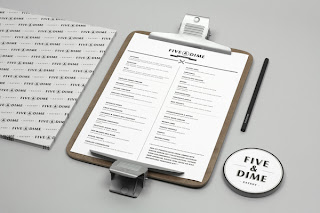
Branding design for a restaurant/café in Singapore. A coin is used as a visual representation of the name. Five & Dime refers to a variety store where everything is sold for 5 or 10 cents. As such, we produced a series of cheap goods to be sold in the restaurant.
Subscribe to:
Posts (Atom)


