Showing posts with label Stationary. Show all posts

Monday, 30 January 2012

Hunt Studio


Hunt Studio is a Melbourne based multi-

disciplinary design consultancy that is
skilled in brand identity and development,
art-direction, packaging, environmental design,
printed matter, online and interactive design.

We pride ourselves on our exceptional attention
to detail, and a unique process we bring to each
and every one of our projects. We understand the
importance of the client–designer relationship
and commit to delivering our design ideas and
visual solutions to the highest possible quality.
We are driven by passion and we are committed
to design excellence.


Marquee Wines

Identity & Branding


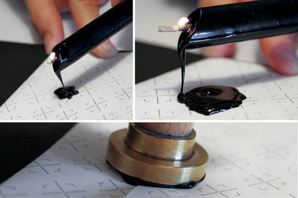
Marquee Wines approached Hunt Studio to develop a brand and visual identity for its boutique wine importing business. The company imports high-end wine primarily from France, Spain and New Zealand. The identity includes a debossed logo depicting an empty wine cellar (with the exception of two bottles). The reverse of the logo inverts and shows the rear of the bottles creating a tactile experience on every part of printed collateral.


Wine Concepts

Identity & Branding
Hunt Studio was asked to develop a new identity and branding for Melbourne-based wine consultants, Wine Concepts. The logo represents a stylised wine label and has been foil stamped on business cards cut from Steven Swiss White stock. The collateral features overprinted wine drops to reinforce the brand and emphasise the product.


Hunt Studio (Identity)

Identity & BrandingAfter a recent move, we took the opportunity to revisit and refresh our own studio identity. Although it still retains the original image and core values, the new identity reflects our progress as a studio. We also took this opportunity to recycle our previous printed collateral, triplexing our former promotional pieces between our new business cards and postcards.
Printing by Taylor’d Press


Tuesday, 24 January 2012

Render Architecture & CGI


PCI

From the beginning stages of this project I was determined to spend as little time as possible in front of a screen and at the print shop. This resulted in a complete range of stationery items that have a unique handmade quality, without sacrificing neatness and professionalism. I hand-cut stencils for the type that appears on the folded posters and the portfolio disk sleeve and had two rubber stamps made, one with the logo and another with my contact information. These stamps are incredibly versatile and can be used interchangeably throughout the various stationery items. A fluorescent red was chosen and acts as a single spot colour.

The full range includes a letterhead, limited edition folded poster, digital portfolio disk, envelope and business
cards. 


Best mens ties

BESTMENSTIES.COM
CLIENT 01 Internet
YEAR 2011/2012

PROBLEM To create visual identity and web shop that will communicate elegance and style to men who enjoy fine neckwear and the fact that the products in the shop have been carefully selected from different brands.

SOLUTION Claim that celebrates pickiness and the overall classic and clean design with refined details.

CATEGORY Visual identity, copywriting, package design, web design

APPLICATIONS Business cards, letterhead, stamp, wax seal stamp, thank-you cards, slogan

[www.bestmensties.com]

web development by: North2


Eastfield

We recently had the privilege to work with Don Carpentier, Owner and Director of Historic Eastfield Village situated in the rolling hills of Rensselaer County, NY,  to develop their identity, packaging and website.
Eastfield is the lifelong project of Don, who is a true renaissance man in a modern world.
Over 18 historic buildings have been meticulously relocated to the current property, many of which
were originally slated for demolition. Don is not only a master carpenter, he is a historian, potter, printer,
tinsmith and blacksmith, among his many other talents.

Currently the property hosts workshops in 18th Century American trades,
provides lectures on art and pottery, and is a remarkable oasis in a chaotic and technological world.

Hovard Design chose to develop an identity to exemplify the village and its time period.
Aside from the web, the identity is either printed letterpress or utilizes rubber stamps.