
Wednesday 29 February 2012


ISTD - IDeas
I have chosen to do the ISTD brief "It happened on this day". This brief was something that interested me last module but it thought it was too big to actually do something good for it. So now i have more time, i want to tackle this brief.
I started coming up with random ideas for the content of this piece. its important to try and get some solid content and something that im interested in otherwise the brief has no solid context. I really dont want to do a generic publication, its something that this brief falls quite nicely into doing and i don't feel that i want to do this.
however, i have been trying to do something that revolves around visual graphics such as info graphics or event promotion.


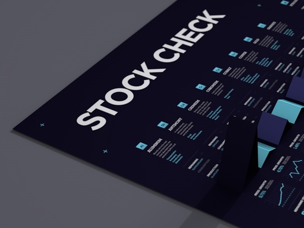
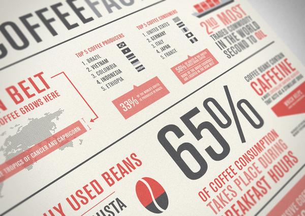
Going through these ideas the one that caught my attention the most was the idea around Trees. My basic concept at this stage is to use the trees or a tree to try and map out days in the years of its life that have had a dramatic affect on the world. This idea gives me scope to work with info graphics, which i've never done before, as well as work with finishing and process to produce it.
Texts
I have just brought together the texts that im using for the book posters, i have had to change the book of The Northern Lights to The Amber Spyglass, as the northern lights was unavailable:
Under Milk Wood
Great Expectations
Amber Spyglass - PDF
Animal Farm
LOTR
Under Milk Wood
Great Expectations
Amber Spyglass - PDF
Animal Farm
LOTR
CLEO TAVERN - logo development 5
Taking on the last logo idea, i have started to develop the ways in which it can be edited. More specifically the lines, by adding a different weight to them i can create different definition which could add to the texture of the logo and be used across a range of different concepts relating to the brand.
As i worked through them and analysed them i realised that in-fact it was much better to have the simple lines that were 1mm across as this added more definition to the Cleo element so that when the tavern element was applied it didn't overshadow the background image. I need to whole thing to work and balance.
I am really happy with this logo choice, i now need to work on perfecting it so that the tavern element is applied in the right way and push it a bit further to see if any other patterns can come from it.


Cleo Tavern logo development 4
This is by far the strongest concept i have come up with, and it transfered to screen well. The idea behind this was taking inspiration from fields/ploughing/rope/string/pony tails. Its a random mix, but simplified down in an abstract format it can create a line pattern that encompasses all these elements. By transferring this onto Bodoni i could get the definition of the lined pattern, whilst using the tavern element to layer over the top and create definition and balance between the two elements. By using this line pattern i can begin to take elements out to create an identity for the brand. I feel a lot more comfortable with this logo and i can see the potential in it, whereas the others i couldn't really see how far they could go and how i could use them to create a cohesive identity.
Cleo tavern logo development 3
The concept behind this logo was adding a slight drag to the letters, this is to insinuate the idea of traveling, speed and movement. Which is all associated with the sort of cliental the stereotypical tavern used to have. I changed to using Bodoni, because it can give more depth and definition to the edit i applied. By balancing it out with avant garde and futura there was a balance between the two types. However, i think that the Cleo element completely overshadows the tavern bit, and the tavern element can end up getting lost. I also applied the over layering technique to the logo, but this again just ended up over complicating everything. I like the concept but i dont think that its strong enough to pull a whole logo together.
Cleo tavern logo development 2
This was another idea, switching the e around. I like the look of it but it is not appropriate for the tavern image, it looks too clinical and it kind of looks like it should be used in a doctors, or at some medical testing facility as opposed to a sophisticated tavern in London. Its gone too far one way. I think the concept it fine, but it isn't appropriate to what i am trying to create.
Cleo Tavern logo development 1
I have started developing the sketch ideas this was the first initial idea i had after re-designing them. I wanted to create something contemporary with a vintage twist, the style of overlaying type is popular at the moment and it gives a nice affect as it creates depth to the logo. I took the concept and started playing around with the placement. The more i worked with it the more i liked the concept of the overlaying, but not necessarily the type face. I think it works for the cleo element of the logo but when i started to add the tavern element then it began too look too complicated and not weighted right.
This style is still a possibility but the general logo is unbalanced and therefore i wont be using it.
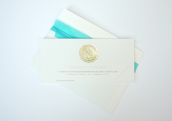
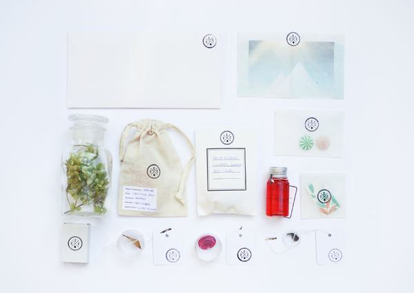
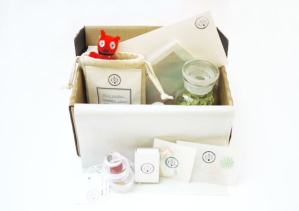
Come Closer Club
Special Collection for the color collection presentation for the automotive industries.
Invitation and Club Box, that invites all club members to collect favorite items with great color impressions to show and discuss at the workshop.
Invitation and Club Box, that invites all club members to collect favorite items with great color impressions to show and discuss at the workshop.


Subscribe to:
Posts (Atom)