//| I have taken the logo and started applying it to a pattern, I had an idea that we could cut through on the swing tags this way it would be using the same concept with the logo and applying it to make a tactile swing tag.

Showing posts with label Brief 9 - Fashion Student. Show all posts
Showing posts with label Brief 9 - Fashion Student. Show all posts
Wednesday, 15 February 2012
Alias
//| I have taken the logo and started applying it to a pattern, I had an idea that we could cut through on the swing tags this way it would be using the same concept with the logo and applying it to make a tactile swing tag.

Alias logo
// Within the logo, i have edited so that it represents the separate items of clothing that Poppy is proposing to sell within her brand. Each blocked off section links to a specific item of clothing. For example the large middle triangle represents a shirt. Whereas the two blocks at the side represent trousers. and so on. This was a concept that Poppy came up with, and I have just executed it within her designs. The next stage is to work out the most appropriate format for it to be delivered in.

// SHIRT

// TROUSERS
Monday, 13 February 2012
Alias
I received Poppy's logo today, it was a bit of a mess so my main aim at the moment was to tidy it up, so that i can start applying it to its relevant deliverables. Once the logo is tightened i can then use its pattern to start creating patterns, developing them and using them to inspire more applications.


Wednesday, 25 January 2012
Meeting with Poppy
I had a meeting with Poppy today to discuss what exactly it was that she wants and how we are going to go about it. I think its important to try and work out what it is she wants, so that i can help.

We outlined the deliverables for her branding, and from there we have decided that i am going to put together the logo on a range of different stocks with a range of different finishes and then we will work out how best to apply them. Seeing as she has already organised the logo, its easy to apply it. We want to try and create something that is tactile, and daily heavily process driven. So it will be a case of exploring the right method of printing to do for the applications.

We outlined the deliverables for her branding, and from there we have decided that i am going to put together the logo on a range of different stocks with a range of different finishes and then we will work out how best to apply them. Seeing as she has already organised the logo, its easy to apply it. We want to try and create something that is tactile, and daily heavily process driven. So it will be a case of exploring the right method of printing to do for the applications.
Tuesday, 24 January 2012
Nordstream Off
Identity for strong men who are engaged in hunting, fishing and a safari on Kola Peninsula. The logo represents letter N entered in the tire tread image. Font style continues a sign. The special accent is made on the materials selection: noncoated and a kraft-cardboard, the manual stamp, tinware, a newsprint as the package material.
Work team:
design: Valeriy Golubzov, Pavel Emelyanov
presentation: Pavel Emelyanov
Design studio Eskimo (Murmansk, Russia)
Design studio Eskimo (Murmansk, Russia)
Full size images at:
http://www.ekimodessign.ru
http://revision.ru/s/eskimodesign
Special thanks to Andrey Pleshkov for photoshoot.


Metrio Coffee
Metrio Labels Packagin was created thinking in represent a high end of Coffee, Differents flalvours, differents specifications to every one. A delicate and strong design clean, delicate, rich in details for create a cool ambient for the owl feel fresh in the kitchen of a australian. if you are based in australia maybe can get a bag and tell me of impression about of flavour and if really is well represented ;-) some other shots can be adCoffee Labels...........For more information: www.metriocoffee.com.au


Change by Design
Commissioned by The Design Society to design collaterals for a lecture by Tim Brown, CEO & President of IDEO. Lecture is about bringing about improvements through design thinking. A venn diagram is used to represent design thinking. Programme booklet for the lecture comes in the form of a notepad with blank pages for the audience to take notes.


Monday, 23 January 2012
Construct
Some really clean branding, working across a variety of different materials and formats in order to deliver some interesting publications and print formats.


"Koffmann’s – Restaurant Identity
Legendary French chef Pierre Koffmann recently returned to London with his new restaurant, Koffman’s, at The Berkeley hotel in Knightsbridge. The three Michelin rosette chef takes a step away from the haute cuisine of his famous restaurant, La Tante Claire, to indulge a love for the informal Gascon cooking of his maternal grandmother. The authenitc neighbourhood feel of the restaurant is reflected in the identity and branding, with its French bistro vernacular and ‘signatures’ theme. A little piglett that appears on menus and coat checks is an irreverent nod to Koffmann’s signature dish, pig’s trotters."


"Mulberry – Brand Book
Written, designed and produced by Construct, the Mulberry brand book communicates the fashion house’s personality. Inclusive and accessible in design and content and ethically produced the brand book was distributed to Mulberry’s 800 plus members of staff and is used to communicate the brands unique perspective to journalists, partners and collaborators. The book proved so popular that is has been reprinted as postcards for staff to use and the phrases used are regularly referred to in the brands daily business."


"Tim Walker/Mulberry – VIP invitations
Invitation collateral for Mulberry’s private screenings in London and NY of internationally renowned fashion photographer Tim Walker’s ethereal film short ‘The Lost Explorer’. Construct found inspiration for the VIP invites in the central canary motif in the dark, dream-like tale (the cast includes 300 of them).
Each consists of a crafted card, hand-delivered in a delicate bird cage with a single yellow feather. The commemorative booklet is wrapped with a thaumotrope, the classic Victorian optical toy that merges separate images of a canary and its cage as the disk-on-a-string spins."


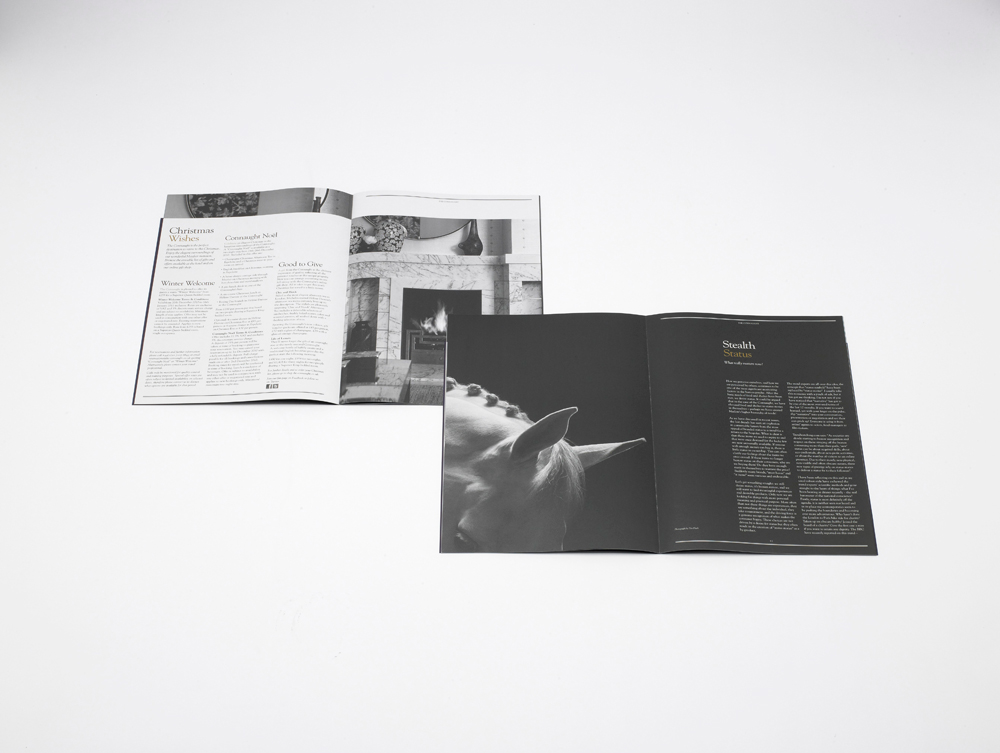
"Maybourne Papers – Editorial Design and Content
This is another example of Construct pushing the boundaries of a design studio’s involvement in client projects. With design and editorial content by Construct, each of the three newspapers for Claridge’s, The Connaught and The Berkeley has a distinct tone of voice but shared design elements that quietly reinforce their mutual Maybourne Hotel Group ownership. The quarterly newspapers are for guests and enjoy a print run 30,000."


"Villa is a remarkable cultural and gastronomic venue in development in Budapest, which sits at the heart of the city’s World Heritage site and boasts striking interventions by Japanese architect Tadao Ando.
Construct’s responsibility for brand positioning has involved the studio in the project on a number of levels, from advising on naminging, service, personality, content and the overall aesthetic to to reflect the unique combination of ancient history, 19th Century refinement and 21st Century innovation. Although the site is not scheduled to open until 2011, the identity with its elegant and classic Roman numerals, is already being used to support the development programme.
Subscribe to:
Posts (Atom)