Showing posts with label Brief 2 - Cleo Tavern - DC. Show all posts

Friday, 9 March 2012

Cleo Tavern

Now i have some structure to apply the content to i have taken and created menus from the research i have already done and created a menu that encompasses food for cowboys/farmers and bikers that would have been served in America in the early years, as well as the food that is still around today. I have a limited amount of food, because this place is still meant for the sophisticated and upa and coming business women/men in London, in a culturally experimental area (Carnaby Street). The food needs to sound homey and pretentious all at the same time.


Tuesday, 6 March 2012

Cleo Tavern

I have sketched out the deliverables for this brief. With the tavern, i really want to try an focus on the little things that can make the brand a working experience. its something that is really important to the brand actually working as an individual unique brand, as opposed to a generic branding project. By focusing on the little things, the big things will take care of themselves.

I have sketched out basic layouts, but i need to try them on screen before anything happens. As it stands the deliverables are:

Table:
Glasses engraved
Table cloth
Table Matt
Drinks Matt
Napkins
Serviettes with tea/ coffee cups

Staff:
Uniform
Ties
Shirts
Tea towel
Note Book (order book)

Menus:
Drink Menus
Food Menu
Bar Matts

Stationary:
Business Cards
Letterheads
Notepad
Feedback Sheet
Thank you card
Stickers - For takeaway

Interior:
Wall graphics

All of these deliverables give a rounded view of what the brand can be and become. It will show interaction with consumer as well as the interaction with staff.


// SKETCHES OF IDEAS

Cleo Tavern - Shirts

For the uniforms of the tavern, i want the logo to be on the shirts, and possibly the ties. I want the establishment to be sophisticated so i think its appropriate to have the logo embodied onto the garments. Whether it be a shirt of a polo, because it needs to work for both men and women.
So i have been researching where i can get one offs done just to see how much they would cost, and if i can get it done cheap then i will defiantly use them to complete the range.

EMBROIDERIT:
Polo Shirt 
Shirt / Mens
Shirt / Womens

Logos4polos:
Shirt / Mens
Long sleeve Shirt / Mens
Ties


Logos4Polos, seems to be the cheapest option and it has a good reputation as well as a huge range.
Im going to order one just to see how it looks, and if it actually works with the logo. It'll be a good test to see whether it actually works or not.


Cleo Tavern

For this project, i am focusing a lot on the aesthetic of the brand and how the logo would work across a range of deliverables to give a clear image of how it would all function as a whole. one of my ideas was to have the logo engraved onto glasses, so i have been researching how you can do it. I have found a website where it is relatively cheap to get your logo engraved onto a range of different glasses.
They do: [LINKS WITHIN EACH]
Pint Glasses
Tankards (Which could work really well with the aesthetic)
Wine Glasses
Tumblers
Half Pint
Cider Glass

There is also another website called fluid branding, which has a much larger range, and the priceses seem about the same. I have emailed to find some quotes.


Wednesday, 29 February 2012

Come Closer Club

Special Collection for the color collection presentation for the automotive industries.
Invitation and Club Box, that invites all club members to collect favorite items with great color impressions to show and discuss at the workshop.


Tuesday, 28 February 2012

Cleo Tavern - Moodboards

I have been trawling through my research trying to gain some inspiration and perspective for my project, especially now that i have changed my idea. I have been going through logo books and the branding research i have done, just to try and see if anything will jump out at me so that i can get some new ideas, or change the ones i have already done.
I want to use a mixture of modern formats of type in the logo, as well as use old print techniques and styles in order to get the heritage of a tavern across.


// Going through these design i have started looking at doing some more designs, im not leaving the ones i have already done but it gives me a better idea of what i want to achieve.


Cleo Tavern Brainstorming

Im getting frustrated with these brief, not because of the concept but because i really dont want to churn out some generic cliche design. I want to try and twist it or turn it around into something more interesting. So after the two crits i had today i have started brainstorming some ideas on where i could place the tavern and how i can make it work aesthetically, as well as getting some initial ideas down for the content of the menus/tavern.


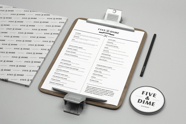
// The idea here is now to bring the Tavern across to London in Carnaby street, which is a novel street in itself, surrounded by new and exciting shops that appeal to a young sophisticated and trendy audience. There is a mixture of culture that happens around there and this is somewhere i feel the novel idea of the tavern can be brought into and would work. 


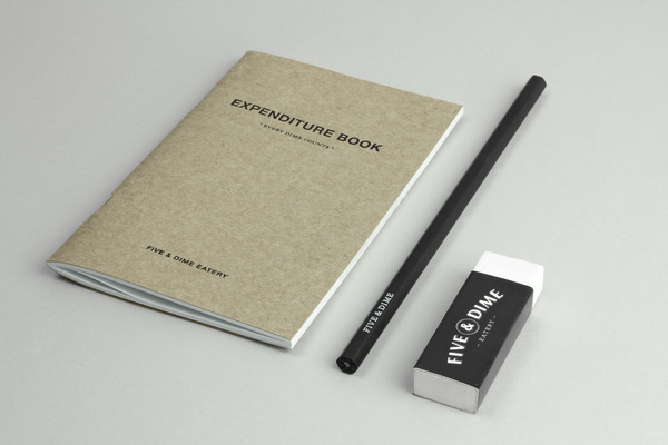
// From here i have broken down the areas that i want to have behind my logo and identity. It is important that they all overlap and work together to form a cohesive brand and identity. 


// I brainstormed some ideas about cowboys/ farmers from years ago, so that i can have some traditional American dishes that would be appealing now. 

Logo moodboards


Re-Evaluated Cleo Tavern Brief


Friday, 24 February 2012

SELLAR


Sellar Development is a privately owned property investment, development and management business based in London and responsible for such high profile projects as The Shard and London Bridge Place. The company approached brand design agency Campbell Hay to develop an identity that would reflect their ongoing partnerships, collaborative process and involvement with the architectural world.
They asked us to redesign and rethink their position within the property development sector. Through discussion with the client it became apparent that it was the partnership with talented teams of professionals and visionaries, that made these projects possible. To reflect this partnership led approach we created the new Sellar logo and graphic device and applied it across a beautiful range of printed stationary and communication.
- Taken from the Campbell Hay website
I am a great believer in simple but truthful identities that show restraint and avoid compounding too much into a single logo or logo-type. Sellar is a great example with a clear logo-type that is constructed with a sans serif simplicity and a wide monospaced execution that balances positive and negative space neatly resolving the company’s involvement with interior and exterior structures. A geometric pattern that blends two and three dimensional qualities furthers this theme but also hints at the wider network Sellar draws from and their collaborative approach to business. Applied as both a printed and embossed surface treatment alongside frosted substrates and a modernistic colour palette (that plays on the idea of light and shadow) delivers a distinctive architectural sensibility across the collaterals.


BRIGGS & COLE


Briggs & Cole is a Glasgow based art and design partnership that specialises in the creation of ‘statement’ products for interior settings. The company commisioned independent identity design agency Effektive to resolve their unique, practical and simple approach to high quality design.
“Briggs & Cole are an innovative Glasgow based product/design/art partnership. Working a lot with metal/glass and interesting finishes to create interesting design products such as tables, glassware and wall art installations. We are working on their primary identity as well as a monogram which will be laser etched, stamped, embossed into their products. We are currently working on the various print materials and packaging as well as a new online shop.”
- Taken from the Effektive website.
I love the intricate typographic detail and layout of the roundel and its technical cross sectional quality delivered through consistent line-weights and geometric character construction. The ampersand functions well as a centre point (through its circular lower half and diagonal intersection) enhancing the sense of geometry and emphasising a measured and knowledgable approach to design. It’s clean and clear with a nice balance of internal space and while the horizontal layout loses some of the roundels relevance it adds flexibility and breadth to the identity. The embossing tool works really well with the line and typographic execution of the logo-mark especially across the uncoated and unbleached substrate delivering a great sense of simplicity, practicality and functionality. The gold foil sticker feels a bit superfluous and slightly contradictory but actually manages to deliver an interesting contrast against the utility of the other materials and accentuating the aspect of high quality with a bold seal of approval. The ink and stamp aesthetic gives the brand an important handcrafted sensibility that balances out what might be perceived as stark and impersonal functionality.


Five and Dime

Branding design for a restaurant/café in Singapore. A coin is used as a visual representation of the name. Five & Dime refers to a variety store where everything is sold for 5 or 10 cents. As such, we produced a series of cheap goods to be sold in the restaurant.