Showing posts with label Publication. Show all posts

Thursday, 12 April 2012

Publication


“We were commissioned by Munich Re to artdirect and manage the development of a new corporate typeface. Working closely with the type designers Kai Bernau and Christian Schwartz the sans serif Munich Re was created over a period of nearly one year. The resulting typeface includes eight weights and many technical features that help improve Munich Re’s diverse and often complex typographical applications. Our knowledge of the client’s requirements helped to develop a highly functional and on-brand typeface.”
You probably don’t remember this, but way back in December 2008 I did a post on Keller Maurer Design. As you can see from the image; that was their old website – a holding page which remained untouched for over a year. That is, until now.
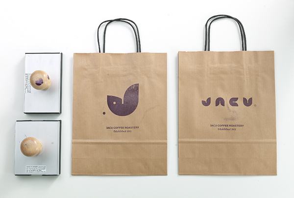
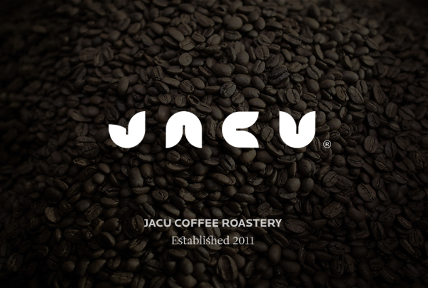
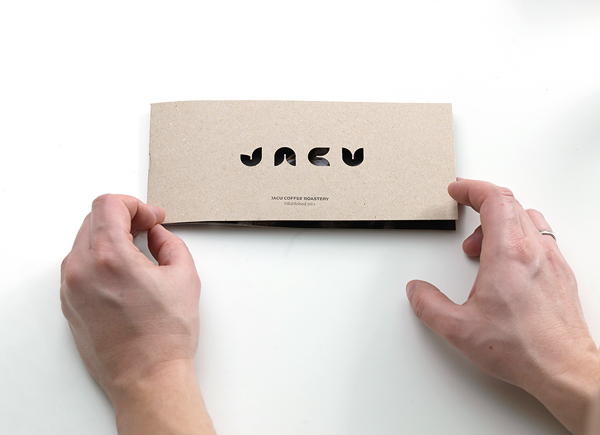
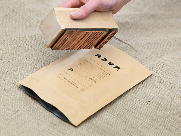
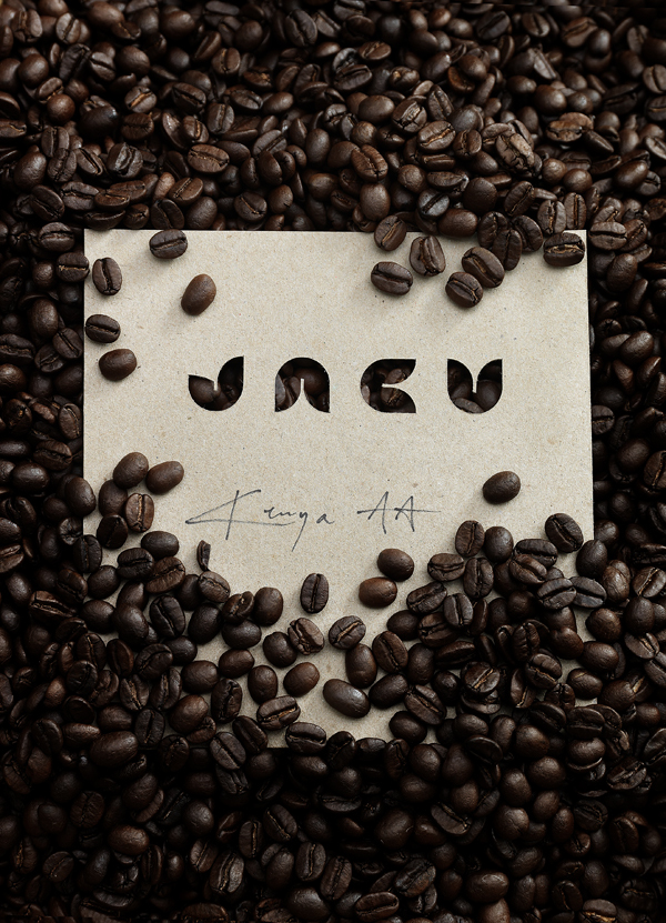
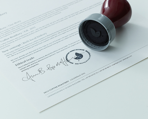
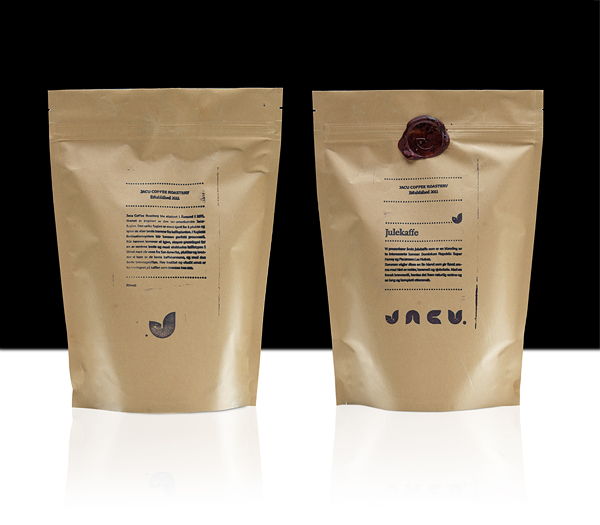
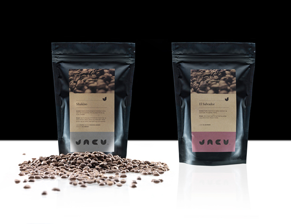
Marcus (one of the founding partners) got in touch the other day with news that they had finally updated their site; to say you’re in for a treat would be an understatement!
I still have more hi-res images to feature on this site, so watch this space.
Thanks again to Marcus for being so amicable.


Friday, 23 March 2012

Publcaition


“The Common Guild are dedicated to producing a dynamic programme of contemporary visual arts projects.
In reference to the organizations name and the idea of a group of craftsmen or a governing body, we aimed to create an identifying mark, which could be stamped, etched or embossed. This would serve to ‘authenticate’ the diverse range of Common Guild activities: exhibitions and events, including gallery-based exhibitions, non-gallery projects, interventions and collaborations. The delicate line-work and application of the logo mark are a direct reference to a printers ‘chop marks’.
The logo mark works alongside a palate of 3 typefaces to allow for an adaptive tone of voice across all future design work and importantly, to accommodate and respect the intent of the respective artists involved in CG projects.”


Friday, 24 February 2012

Jacu Coffee

The Jacu bird lives in South America and is known for something quite extraordinary; It flies from coffee plantation to coffee plantation and picks and eats the tastiest coffee cherries. The fruit makes its way through the bird’s digestive system, and the seeds of the fruit - coffee beans - come out perfectly processed. These coffee beans are among the most exclusive in the world. This story has inspired us, and the bird has lent its name to the new micro-roastery in Ă…lesund, Norway. JACU COFFEE ROASTERY was established in 2011. Like the jacu bird, they pick and roast only the best beans. They look for great plantations, optimal processing, and the roasting profiles which will make the most out of each bean. They work with passion, patience, and without compromise.


Monday, 30 January 2012

Six


From the Editor
It was only 4 days ago that Six updated their website with new work for the first time in years (actually a year – it always sounds more dramatic when you exaggerate things!) So far there has been very little press, so obviously I had to jump in on action whilst I had the chance. Not willing to settle with the “tiny” images on their site and subsequently throw a quick post together, my homeboy Darren Firth sent me a generous selection of high res images covering their most recent work and some older favourites which equally deserve a mention.
Hope you enjoy this feature and cheers again to Darren for giving me the honor of resizing each image myself ;)
Background
Six is an independent creative consultancy based in the UK, providing design and art direction for brand, print and screen. Concentrating on strong ideas, solid research, clear strategic thinking and attention to detail, Six develop collaborative relationships with their clients and partners to create original, distinctive work that engages users, satisfies clients and meets the high standards and innovation and creative excellence that are central to the studio practice.


Projects
—Dropyx
Identity and printed collateral
Printed 2 colour, with overprinted logo on Pale Grey Colourplan by GF Smith
—Johnson Tilley Associates
Identity and stationery
Printed in JTA’s primary green and purple, two new brand colours created uniquely for JTA. Printed on Colourplan Cool Grey by GF Smith
—Johnson Tilley Associates
Brochure
Printed in 7 colours, with dust jacket in Colourplan Cool Grey, and an inner cover in Colourplan Amethyst both by by GF Smith. The inner cover features technical diagrams taken from the design and production stage of JTA’s product development which have been printed in a silver metallic ink.
—Brandfluent
Identity and stationery
Printed one colour, with the logo in a matte platinum foil on a combination of Pistachio and Damascus Green Colourplan by GF Smith.
—Loake
Brochure 2009
Printed on GF Smith Colourplan stock with a gold foil on the front cover
—Groove Effect Posters
Posters
Finished with metallic and high bright inks, black foil and printed onto Zen Pure White.